domingo, 17 de janeiro de 2010

Front 242

Ahh! Front 242! Pioneers of EBM yada yada industrial yada yada yada JeanLuc yada yada covers yada yada innovati... Wait a minute! Did I say covers? Yep! I said covers alright!

Front 242 is a pioneering EBM band from Belgium, consisted of four people I don't recall the name of. What you have to know about this band first of all, is that you either love/hate them, or you hate/love them. You can't do only one of these. And this is both musically and... um... coverically. For example, if you loved their new more ambiental direction in the later albums, you'll hate how JeanLuc has apparently decided "Fuck singing!" and resorted to simply sounding angsty.

Yeah. Exactly what I mean.

Now what comes to covers, the story is merely SLIGHTLY different, in the way that they seem to be pissing fans off on purpose.

For example, this is the original cover for their debut: Geography.


Notice how it still manages to look somewhat interesting and modern even today. Well, on its re-release, Front 242 just said "Fuck you! Here's some bad CGI up your ass!"


Oh! So you also thought the cover for No Comment was interesting?


Well, you know what we do to people like you? We push some more bad CGI up their stupid ass!


What?! You're back for more? You say the original cover for Backcatalogue was good?


Well, you know what the acronym CGI means? Crap Gutting (your fucking stupid fanboy/girl/Marilyn Manson) Innards!


And we fucking did that to every single album of ours before Tyranny (For You) as well! Eat that you dumb fannots!


Well, you get the idea. Even our cult hit Front By Front didn't get out with its integrity intact.


Haven't had enough? No problem!


If you want to add insult to injury to your fans, well, just look at the top left corner of the reissues.

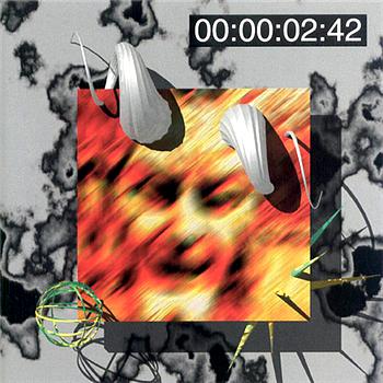
Yeah. Exactly what I mean.

And you know what? They decided to get a fourteen hundreth middle finger on their ungrateful hands when they did the Floyd with Tyranny (For You).


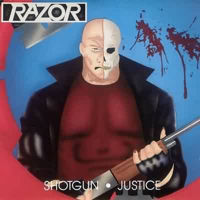
And do the Razor with their best two albums.


And do the Downright Boring with their most unusual and interesting album.


Yeah. Exactly what I mean.


Oh Yeah! You Knew This Was Coming!


You knew this was coming from the first time you entered this blog. Otherwise, why would it be called Back To The ROFL?

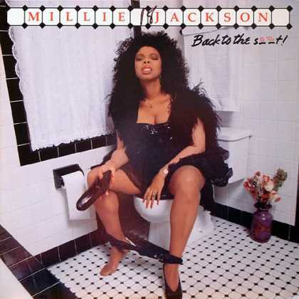
In case you didn't know it, the album is Back To The Shit and is a prime example of a joke gone horribly wrong, and still manages to leave some questions unanswered.

From the photo, you will probably conclude that Millie was in the middle of a show but just had to go. Okay. Nothing strange so far, but what's with the pigface? And why is she holding her shoe? If you look closer, you'll also notice that the lid is closed. What does this mean? Is she trying to disgust you out of her bathroom or something?

If that's the case, I guess I'll just have to say that the album should have been called Get Outta My Fuckin' Toilet.


PS: Forgive the shitty quality of this post, but I'm in a bit of a hurry and forced myself to listen to Korn while doing this review, which, as I just discovered, has an absolutely mind emptying effect.

sábado, 16 de janeiro de 2010

Thrash Getting Thrashed Years

If you lived in the 90s, you might remember some things about it. The Downward Spiral, the downward spiral of NIИ, the downward spiral of clothing, the rise and subsequent downward spiral of grunge, the beginning of the downward spiral of the alternative scene, the rise of nu-metal and the downward spiral of thrash, which only fully recovered by 2004-2005.

During these years, thrash metal bands opted to significantly reduce the quality of their music for a more accessible sound, and the quality of their covers as well, to fit the standards set by the likes of Korn and Nirvana,

You can see these weren't very high.

And LOOK more controversial than you actually aren't, which is kinda stupid for thrash metal bands, which are, in theirselves, kinda controversial.

This gave way to some really crappy covers.

Let's start with the piss-poor cover for Load, by Metallica.


Wait a minute, that's not right! This is not piss-poor. THIS is piss-poor.


Load is jizz-poor. Toilet humour aside, I'm dead serious. The covers are, respectively, photos of bloody jizz and bloody piss. Some more toilet humour aside, I mean that these are photos of bloody semen and bloody urine, respectively.

According to Nirvana standards, it seems that, while showing a three month-old's penis is acceptable, mentioning the name of what comes out fo it is already way too controversial, and might cost a couple dozen fans, so, instead of Metallica being stuck with albums called Jizz and Piss, they are stuck with albums Load and Reload, with pictures of jizz and piss. It's up to you to decide which is more embarrasing. It's a relief, though, that we had a happy ending to that story in 2008.

In 6th June 2003, Metallica wake up with a hangover wondering what the hell happened.
For thirteen years.

And this didn't happen just to Metallica. For example, can you make ANY sense of what Anthrax were trying to say, or what kittens they were huffing?


The album is Stomp 442, and apparently they chose the name of the album and its cover at random., since the first thing that comes to mind when you see this cover is "Metal balls don't go stomp! And naked guys holding a stick don't go stomp either!"

This hitting-a-bong logic also applies to Destruction's The Least Successful Human Cannonball.

Having a cannonball through your head doesn't make you a human cannonball.
Or a human, since humans are known to think over their actions first.


Kreator, on the other hand, decided to go the faggoth route.

We wrote our name twice, just in case you didn't get it the first time.

Have you noticed something, though?

Let's take a look at the band logos.


Have you noticed that, on those albums, the logos are different and more simple, like they're ashamed of their music? Like they weren't the real band anymore? Oh yeah. They were being posers. And they knew it.

quinta-feira, 14 de janeiro de 2010

Deciballs

Now, as far as music goes, Razor is possibly one of the best bands to come from Canada. When it comes thrash, they are the best to come from Canada.

Whether making 10-minute thrash epics on Custom Killing or playing the same song 14 times (thus being the real inspiration behind Dragonforce) on Shotgun Justice, they've always managed to deliver and make some of the best songs for making roadkill out of senior citizens. If there was a speed limit in music they would have broken it, rebuilt it, burnt it half to death, gang-raped it on top of a jet fighter till it had atomic AIDS, had it watch American Idol auditions 73 hours a day for 2 weeks while Michael Jackson humped its leg (these guys haven't made an album since 1997), and then had Chuck Norris stare at it till it crumbled of fear and came on fire. Also, they made shitty album covers.

Note that this is merely their SECOND worst album cover.

Now, I could have gone on for AGES about their album covers,

Oh yeah!

And this IS its real back cover

...but since I somehow managed to find one of their albums at the mall for 10 euros, I'll talk about it instead.

The album is Decibels. Their latest and possibly last album. Since I've actually got the album itself, I might as well talk about this one in a little more detail.

Before I go to the cover, I want to throw in a little extra from my usual posts.
Basically what I got with then album was a nice little booklet, the CD and a little brochure from Plastic Head Mail Order, and when I opened it and put the disc in the player, it looked like this:


So, you'd think that the band was a trio during the recording of this album. HAHAHAHAHA!!!!! Not a chance! We fooled you, sucker! .|.|.|.|.


Just like we fooled you into thinking this would be a shitty album, by the cover.


Now, I must definitely agree that this cover is approximately 2341 times better than the other ones by this band, but that's like saying that eating turds for breakfast is better than being mutilated.

Also, while reading the notes I found this.


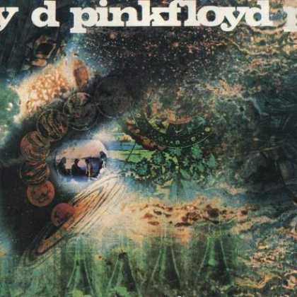
So they mean that they didn't simply google "guy covering ears" and put the first result on the cover, and instead, made a photoshoot of the guy covering his ears, so why is he barechest? Ok, maybe he's a construction worker. But why's he translucent then? Is he a late construction worker? And if that's what he is, then shouldn't the album be called The Adventures Of Roland's Ghost, Who Can't Bare The Noise Of Buildings Crumbling After Being Stricken By A Giant Half Of A Razor Blade, instead of Decibels? On the other hand, then you're going perilously close to Pink Floyd territory, and the cover should have then looked like this.


sábado, 9 de janeiro de 2010

Slipknot

First of all, Slipknot are NOT Death Metal. They're slightly more talented nu-metal, which is like saying that suffering from autism is better than suffering from Down syndrome.


Please note: System Of A Down are Alternative Metal

To be more honest, Slipknot were much better (or at least more interesting) in their beggining days, in the Mate.Feed.Kill.Repeat. era. That is, before they decided to hire Corey Taylor.

Slipknot, like Pink Floyd, have an amazing ability at making covers which have nothing to do with the albums. Unlike Pink Floyd, though, they don't couple that ability with talent for making good songs. Pity.

Now, for the covers.

You know that Slipknot come from Iowa, right? Iowa, known for corn fields, beautiful skies, nice people, right?

Above: Nice People

Wrong! According to Slipknot, it's known for dead goats.


Similarly, the title Mate.Feed.Kill.Repeat. can perfectly represent absolute control over a person, right?

Wrong again! According to Slipknot, Mate.Feed.Kill.Repeat. is best represesnted by Joey Jordison in a room with cogwheels.

Apart from that, they also seem to have run out of ideas by their third official album, and just started recycling their older covers.


Proving that, to be popular, you only need 5 ideas.

Running In The Rain Is A Way Overrated Activity...

...At least, that's what you'd probably think the title is, judging by the cover. Actually, the title of this album is I Get Wet. Yes, this guy's hair is evidently wet, so I guess he's indicating that he tripped on something while running in the rain and fell face-first to the floor.

Well, actually, the real story of the cover is way funnier, so I'll just tell you that instead:

In order to make this cover, Andrew W.K. Hit himself in the face with a brick. Unfortunately, he decided he wasn't pouring enough blood all over the studio floor, so he got animal blood from a butcher's anyway.

So, all Andy really proved with this episode was that he's an idiot. Or maybe a masochist. Or both.

quinta-feira, 7 de janeiro de 2010

Meshuggahnism

"NO MORE LIPS! NO BUYERS! NO HAPPY YOU WATCHING! NO WONDER RACE! WHERE THE HECK IS IT?!"

Those are the first lyrics you hear on the album obZen, by Meshuggah. The lyrics are, in fact "No more ifs, no bias, no ambiguity. No wondering wether this is it"

But nevermind that. As much as I like the song Combustion, I always found myself giggling when Kidman comes in at 1:06. This is the first song from Meshuggah's new album. I don't have the album itself yet, but I've heard that it's their comeback, returning to the glory days of Destroy Erase Improve.

I'll talk about you someday too

But it's the cover I'm interested in for now. The first time I saw it was on a tiny picture from Myspace, where it looked like it stunk of bad CGI. I was "glad" to find out out that it wasn't like that in a bigger resolution.

Now, for a little warm-up, I'll show the easier-to-find-in-a-store edited version.


Notice that this bald guy's hand is a reddish pink. If you look closer you'll discover that it is in fact blood, and well drawn too. This cover is excellent. It's zen, as its name implies, and it's still definitely metal because of the Red Right Hand (pun intended).

Now take a good look at the abomination that is the original unedited cover.

Ouch!

What the hell has happened here?! What's with the all the blood? And the guy just meditating there? And the platform he's standing on? And his OTHER Red Right Hand (just look up Red Right Hand if you don't get the joke)?!

For about two months I have been trying to make some sense of this cover. The only explanation I managed to make that is in some way plausible is that this guy went to this platform to perform some sacred ritual that involves jerking off with your three hands 'till your dick fucking explodes. And then you meditate.


Pink Floyd

Had you read my first post carefully, you've probably seen this coming. Before you get pissed off at me, Pink Floyd is one of the best bands to come from Britain. Knowing who they have to compete with, that is one helluvan achievement. But one thing they had always really good at was making covers that had nothing to do with the album title.

Yes. I agree that The Wall could not have been more literal


And that the cover for A Momentary Lapse Of Reason has at least something to do with the title, showing just how bad having a sticky "1" key on the keyboard can really be.

"The 11111 beds he ended up ordering were so expensive he had to sell his house"

But for the rest of them, you really can't say any of that.
For example, the heart of a cow is definitely not the size of a fucking atom, so why call an album Atom Heart Mother and put a picture of a cow on the front cover...


...the back cover,...


...AND the disc itself?


"Moo!" ("WTF!" in Cowish)

Similarly, while the cover for Dark Side Of The Moon is about as recognisable as fucking Mona Lisa, it has Absolutely nothing to do with the album title, but appears on both sides.


Long before the album was released, scientists had already taken a photo of the dark side of the moon, and it's much more boring. Even more than Us And Them.

The cover for Piper At The Gates Of Dawn is just uninspired,


and doesn't even show a piper, the A Saucerful Of Secrets cover seems to be more like what puke looks like while you're on LSD,


And the cover for Obscured By Clouds looks like... Hell! I have no idea what it looks like! Anything that isn't clouds or being obscured by them. That's for certain.


If I follow their logic, here's the cover for my upcoming album: Memoirs Of A Carrot


And the following album: The Flaming Printer Of Time


And my masterpiece: 12/21/2012